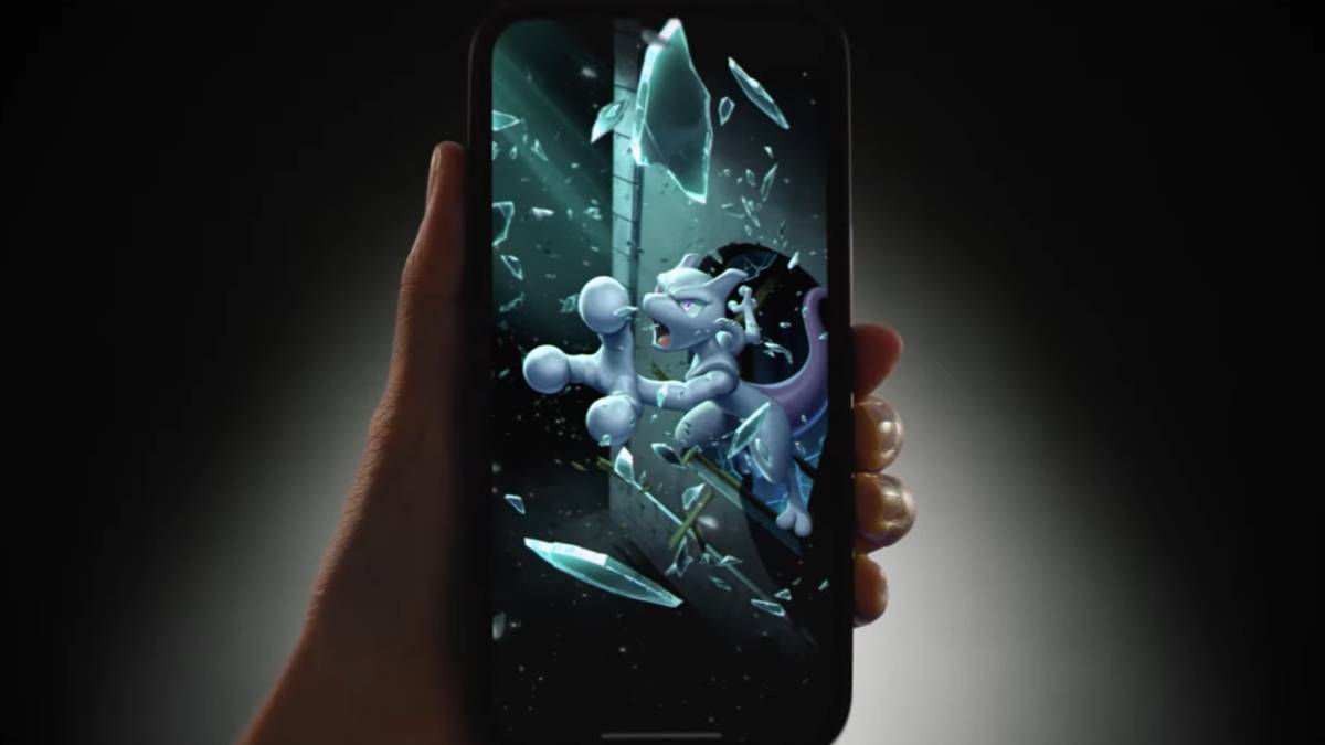
Man Behind Pokémon's Iconic Logo Revealed
When you receive an unexpected call from the president of Nintendo of America, you don’t hesitate—you answer.
That’s the advice Chris Maple received from a fellow designer in 1998, just before he got the life-changing phone call. At the time, Maple was no stranger to last-minute design emergencies. As the founder of Media Design, he specialized in stepping in when companies were under pressure and needed fast, high-quality visual solutions. Though rarely publicly credited, Maple built a solid reputation among local Seattle-area clients like Boeing, the Seattle Mariners, and Holland America Line cruises.
So when Minoru Arakawa’s secretary at Nintendo of America called with an invitation to meet at their Redmond headquarters, Maple accepted—without knowing it would lead him straight into history as the designer of one of the most iconic logos in gaming: Pokémon.
Go West, Pocket Monsters
Maple recalls walking into Nintendo’s lobby and being struck by an unusual sight: a crystal horse head displayed prominently in the room. He sat there for about half an hour, absorbing the atmosphere.
“I had to read the room,” Maple explains. “As a designer, I’m often the subjective person brought in to fix something visual or branding-related. You learn to sense things.”
Eventually, he was taken upstairs where Nintendo executives—including Arakawa—were waiting. Maple describes Arakawa as a magnetic presence, clearly a leader who earned his position.
Then came the surprise.
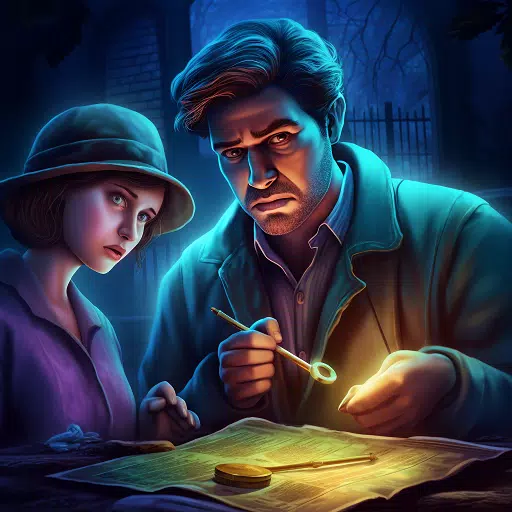
Arakawa introduced the project: a game known in Japan as Pocket Monsters. The name would be changed to Pokémon for its Western release. But Nintendo hadn’t found the right logo yet—and Maple was asked to create it.
A woman entered the room with a box full of toys, drawings, and notes, dumping them on the table. Maple looked at Arakawa and asked what it all was.
“It’s a Pocket Monster,” Arakawa replied. “It’s Pokémon.”
The Mystery of the Missing Crystal Horse Head
Since hearing Maple’s story, I’ve been chasing down evidence of that mysterious crystal horse head. It seems like a small detail, but Maple insists it made an impression—possibly even subconsciously influencing his creative process.
Despite my efforts, no trace of it remains online. It doesn’t appear in any known photos or videos of Nintendo’s old Redmond office (which has since been converted into a tennis court). Former employees and industry veterans couldn’t recall seeing it either. Even Nintendo itself didn’t respond to requests for comment.
Update 7:21 a.m. PT: Shortly after this article was published, a reader pointed me to Game Over by David Sheff. Sure enough, page 198 mentions: "In the lobby of NOA’s headquarters is a smoky glass coffee table and a crystal horse’s head in a glass case." So yes—it really existed.
If you remember, know anything about, or better yet—have a photo of this elusive piece of Nintendo lore, please reach out to me at [email protected]. I’d love to finally put a face to the legend.
Attaching Energy
Normally, designing a brand-defining logo would take months of revisions and feedback. But Maple only had a month—the logo had to debut at E3 1998.
Undeterred by the tight deadline, Maple got to work. He sketched dozens of variations by hand, experimenting with letter shapes until he found combinations that felt right. He set aside the ones he liked best to present to Nintendo.
Original Pokémon Logo Sketches by Chris Maple
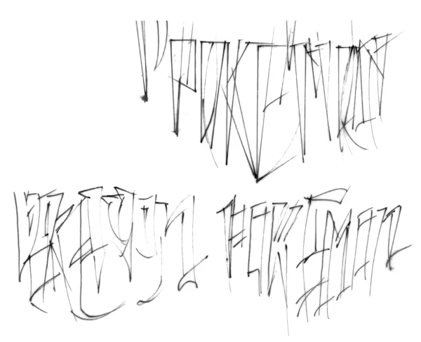
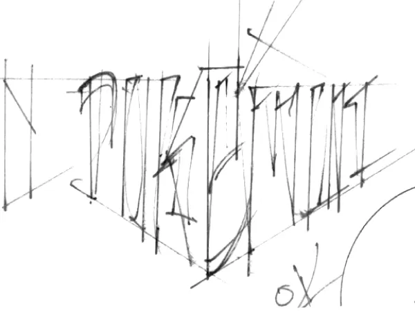
View 8 Images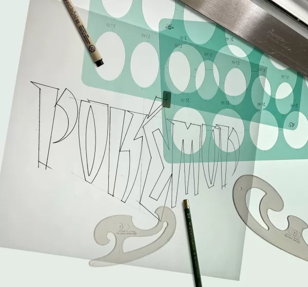
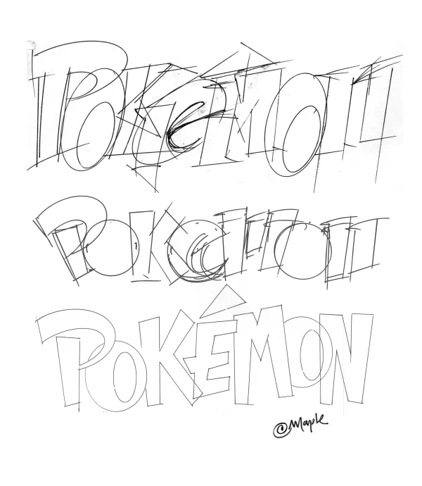
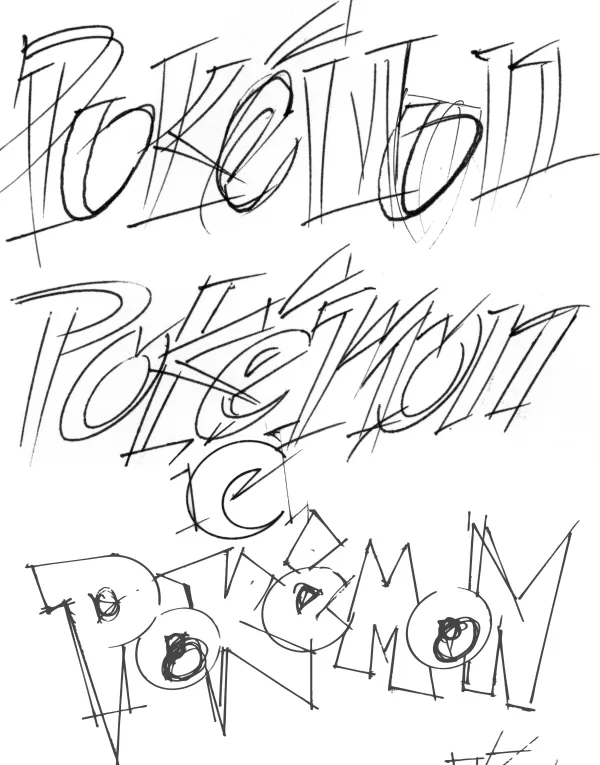
He wasn’t given much to go on. No game copies, just some paper sketches, tiny figurines like a miniature Pikachu, and an early draft of a Nintendo Power magazine. He also learned the logo had to look good both in color and black-and-white, and remain legible on the tiny, pixelated Game Boy screen.
When the time came to present his options, Maple started with a few versions he knew weren’t his strongest. The response was lukewarm. Then he revealed his favorite.
Silence filled the room. Maple stayed quiet too. Finally, Don James, then Executive VP of Operations at Nintendo of America, broke the silence.
“I believe this is the one,” he said. “Yep, that's the one. It's the one.”
Arakawa nodded in agreement. Moments later, Maple was told: “Produce it.”
And so, the Pokémon logo was born.
Maple can’t quite explain why that version stood out—it just felt right.
“There’s energy in it,” he says. “I tried to envision the story behind the brand. Every logo needs to carry that kind of narrative.”
When it came to color, Maple tested many different palettes. While he admits the names Blue and Yellow might have influenced his subconscious, ultimately, he went with what felt balanced.
“It just feels a certain way,” he says. “I know it sounds flaky, but it's true.”
Once finalized, Maple handed off the logo and stepped back while Nintendo took over marketing and launch preparations. He didn’t think much of it—until a trip to Toys R Us with his son opened his eyes.
“We walk in the front door and there's a massive display, big arches and everything, and TVs going and noise and the Pokémon logo, and I'm like, ‘Holy smokes. This is crazy.’”
Pokémon Forever
This wasn’t the end of Maple’s involvement with Nintendo—or with the Pokémon logo.
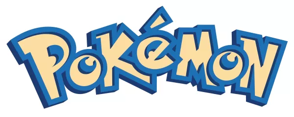
After E3, Arakawa asked Maple to make slight adjustments to the logo. Without specific direction, Maple refined the interior details of the “P” and “E,” resulting in the final version we still recognize today.
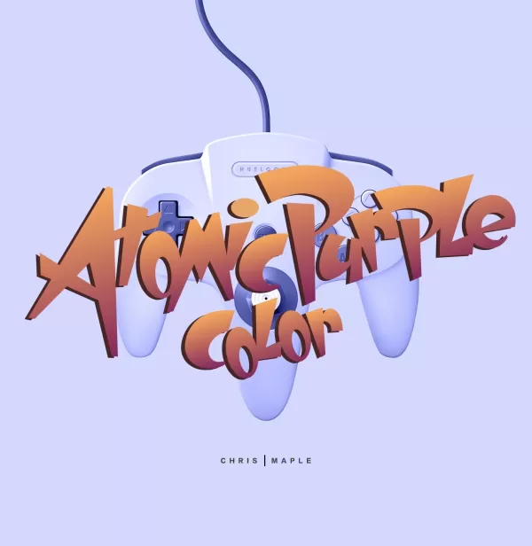
Maple went on to contribute to other projects, including design work for games like Major League Baseball Featuring Ken Griffey Jr., Mischief Makers, and possibly an early Star Wars: Rogue Squadron title for the N64. He also redesigned the packaging for the Atomic Purple release of the Nintendo 64.
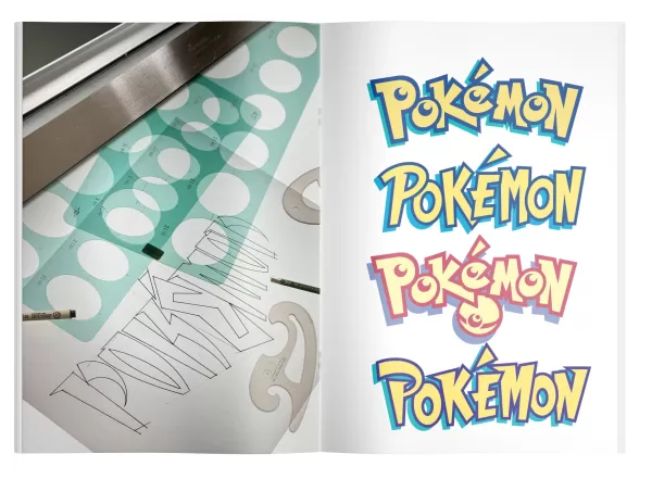
The first final version of the Pokémon logo Maple submitted, prior to the adjustments he made to the P and E.
The Pokémon logo with Maple's adjustments, as we know it today.
Though Maple never became a hardcore Pokémon player himself, he saw how deeply it impacted his son—who collected the trading cards until they were banned at school.
Years later, Maple would find himself recognized in public by children who knew his connection to the logo.
“I'd be at a store or something and I'm buying something for my daughter and she'd be jumping up and down. She'd go, ‘My daddy did that logo,’ and a couple of moms would look at me in line and go, ‘Oh, so it was you, was it? You're the guy.’”
Eventually, Maple stopped working with Nintendo as the company expanded its internal design team. Still, his legacy quietly endured—until recently.
For years, Maple never spoke publicly about his role in creating the Pokémon logo. It wasn’t listed on his website, nor was he officially credited anywhere. At the time, nondisclosure agreements were standard, and individual designers are rarely acknowledged in the branding world.
But now, Maple is ready to share his story. Encouraged by his son, he’s begun showcasing the logo on his site alongside new T-shirt mock-ups and digital renderings.
Why now?
“After 27 years, I thought, why not?” he says. “If I'm going to list this as one of my accomplishments, I should back it up and move forward.”
Chris Maple Modern Mock-up Logo Images
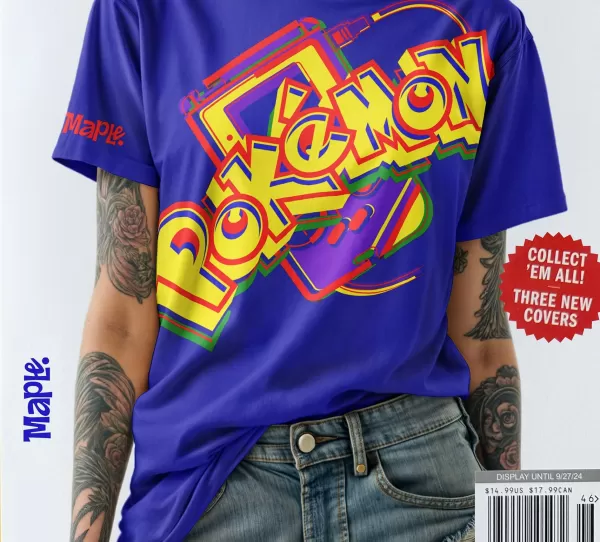
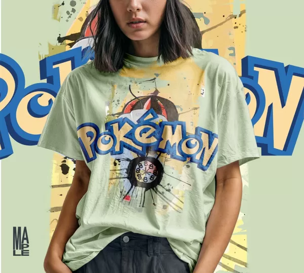
View 4 Images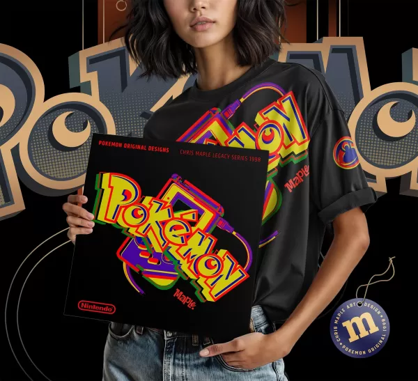
I ask Maple if he’d change anything if he could redo the logo today.
“I’d probably revert to the original version,” he says. “And if Pokémon turns 30 next year and wants to celebrate, I hope they’ll reach out and let me help mark the occasion. It deserves more than just slapping on a number. It needs TLC.”
Maple may have worked on Pokémon for only a few months, but the ripple effect of that single design continues to shape generations.
In his own words:
“In some way, I feel responsible about all the children and people who grew up taking ownership of this.”
And though he never imagined the global impact it would have, he wouldn’t trade the experience
Latest Articles
Trending Games


Top News
![Roblox Forsaken Characters Tier List [UPDATED] (2025)](https://images.dyk8.com/uploads/18/17380116246797f3e8a8a39.jpg)

Latest Games