Is Civ 7's UI as Bad as They Say?
Is Civilization VII's UI Really That Bad? A Critical Assessment

Civilization VII's Deluxe Edition launched recently, and online discussions are buzzing about its user interface (UI) and other issues. But is the UI truly as flawed as some claim? Let's analyze its elements to determine if the criticism is justified.
← Return to Sid Meier's Civilization VII main article
Assessing Civ 7's UI
Early reactions to Civ VII, especially concerning its UI, have been mixed. While some criticisms are valid, a balanced perspective is needed. Let's evaluate the UI against established principles of effective 4X game interfaces.
Defining a Good 4X UI
Defining an objectively "good" 4X UI is complex. Design depends on the game's style and goals. However, certain elements consistently contribute to positive user experiences. Let's use these elements as benchmarks for Civ VII's UI.
Information Hierarchy
A good UI prioritizes essential information. Frequently used resources and mechanics should be easily accessible. Less crucial features can be nested within menus. The UI shouldn't overwhelm the player with unnecessary details.
Against the Storm provides an excellent example. Its building menus are clearly organized by tabs, prioritizing common actions and placing less frequent functions in secondary tabs.
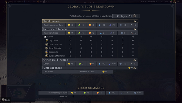
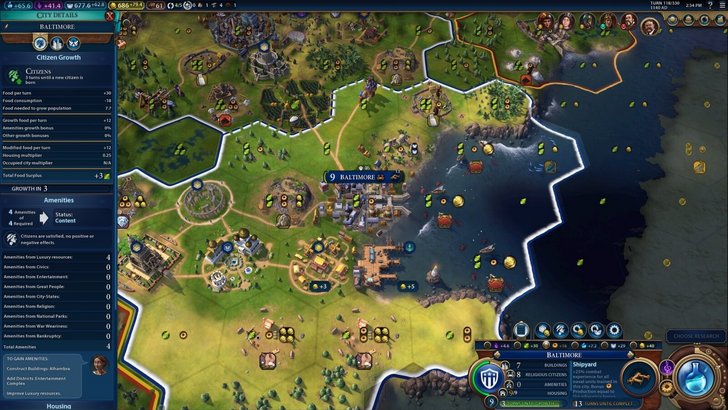
Civ VII's resource summary presents resource allocation, separating income, yields, and expenses. While structured well and collapsible, it lacks granular detail. It shows resource totals from rural districts but not the specific districts or hexes contributing. Expense breakdowns are also limited. The UI functions, but improvements in specificity are needed.
Visual Indicators
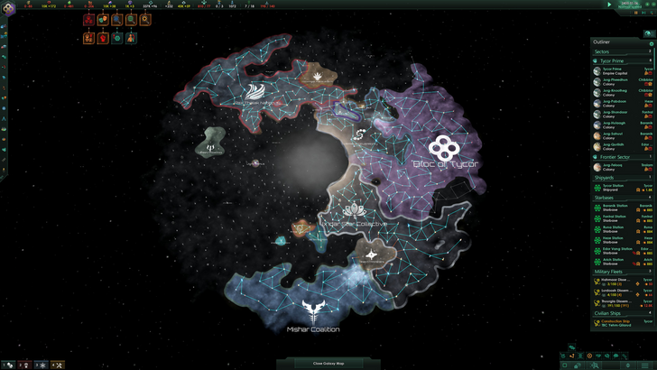
Effective visual indicators (icons, colors, overlays) convey information quickly without relying on text. Stellaris's Outliner, despite its cluttered UI, exemplifies this well. Icons instantly communicate ship status and colony needs.
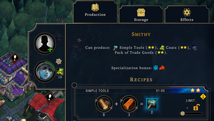
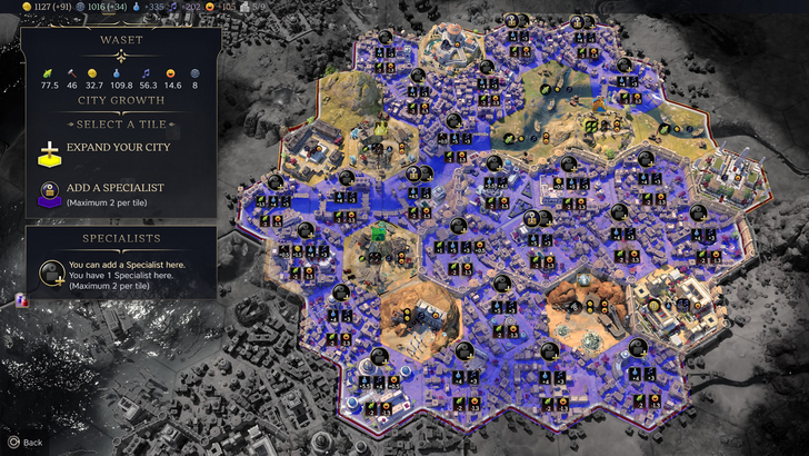
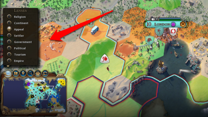
Civ VII uses iconography and numerical data for resources. The tile yield overlay, settlement overlay, and settlement expansion screen are effective. However, the absence of certain lenses from Civ VI (appeal, tourism, loyalty) and customizable map pins are significant omissions. While not disastrous, improvements are needed.
Search, Filtering, and Sorting
As complexity increases, search, filtering, and sorting become crucial. Civ VI's robust search function allows players to locate specific resources, units, or features on the map. Its Civilopedia links seamlessly to in-game elements.
Civ VII lacks this crucial search function, a major drawback. This significantly impacts usability. The absence of a comprehensive search is a significant usability issue.
Design and Visual Consistency
UI aesthetics and consistency are vital. Civ VI's dynamic, cartographic style integrates seamlessly with the game's visuals.
Civ VII adopts a minimalist, sleek design. The color palette (black and gold) is well-chosen but less visually striking than Civ VI. This subdued approach has resulted in mixed reactions, highlighting the subjective nature of visual design.
The Verdict
Civ VII's UI, while not perfect, doesn't deserve the extreme criticism it has received. The missing search function is a significant flaw, but not game-breaking. Compared to other issues, it's relatively minor. While it falls short of some competitors, it has strengths. With updates and player feedback, it can improve significantly. The overall game experience compensates for the UI's shortcomings.
← Return to Sid Meier's Civilization VII main article
Sid Meier's Civilization VII Similar Games

Latest Articles
Trending Games


Top News

![Roblox Forsaken Characters Tier List [UPDATED] (2025)](https://images.dyk8.com/uploads/18/17380116246797f3e8a8a39.jpg)


Latest Games